Jen's Musings | January 2026
In the Studio
As we begin a new year, there’s a natural inclination to pause and look forward, not just at what’s new, but at what feels meaningful. In design, this moment of transition often invites deeper questions: How do we want our homes to support the way we live? What do we want our spaces to give back to us?
The annual “colors of the year” offer an interesting lens through which to explore these ideas. While often viewed as trend-driven, when examined more closely, these selections reveal something far more nuanced: a collective shift toward calm, restoration, and homes that feel intentional, grounded, and emotionally resonant.
Looking at the perspectives of three industry leaders – Benjamin Moore, Sherwin-Williams, and Pantone – we see different paths leading toward a shared philosophy: design that prioritizes experience, longevity, and emotional well-being over momentary impact.
Benjamin Moore: Depth, Elegance, and Architectural Grounding
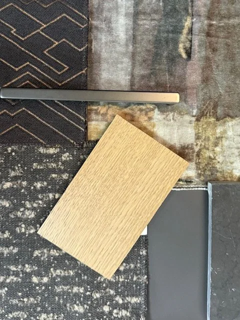
Benjamin Moore’s Silhouette AF-655 is a study in restraint and sophistication. Blending rich burnt umber with charcoal undertones, it creates a deep, grounding neutral that feels timeless rather than trend-driven.
This is a color that works in dialogue with architecture. Imagine a color-drenched room, where umber meets charcoal in a way that feels enveloping – cocooning without heaviness, dramatic yet serene. Used thoughtfully, it enhances architectural lines, allows art and furnishings to breathe, and creates a sense of quiet confidence within a space.
Silhouette reflects a broader movement away from overly bright or reactive palettes and toward colors that anchor a home emotionally and visually. These are hues chosen not to impress at first glance, but to endure and to feel as relevant and beautiful years from now as they do today.
Sherwin-Williams: Warmth, Livability, and Quiet Comfort
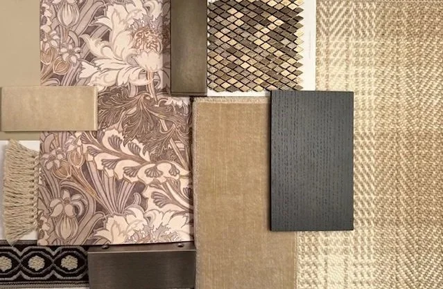
Sherwin-Williams’ color of the year conversation centers on grounding, warmth, and livability, with an emphasis on creating spaces that feel settled and enduring. A standout within this philosophy is SW 6150 Universal Khaki: a warm, mid-tone neutral with a subtle yellow undertone that feels both familiar and refined.
Universal Khaki moves decisively away from cooler greys and sterile finishes, offering instead a palette that feels organic, approachable, and timeless. It works beautifully as a foundational color that supports a wide range of materials and styles without overpowering them.
When layered with natural wood tones, stone, plaster, and tactile textiles, Universal Khaki creates interiors that feel effortless yet considered. These are spaces designed to be lived in and to feel comfortable, grounded, and quietly elegant. Spaces where beauty and functionality coexist.
At its core, this approach reflects a broader understanding that true luxury lies in comfort and ease. Homes designed with colors like Universal Khaki offer refuge from external noise, creating environments that feel calm, cohesive, and intentionally composed.
Pantone: Color as Cultural and Emotional Reflection
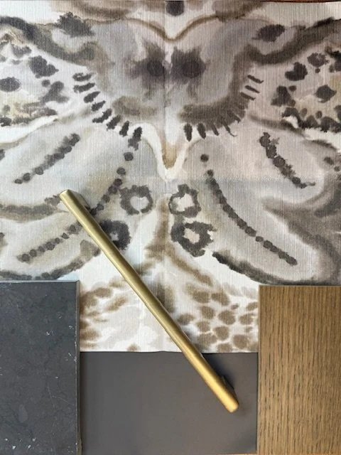
Pantone’s vision for 2026 is rooted in the idea of transitional living, a response to a culture defined by over-stimulation, constant connectivity, and accelerated pace. Their selected hue, Cloud Dancer (PANTONE 11-4201), captures this moment with remarkable subtlety.
Cloud Dancer is a soft, ethereal neutral – light without feeling stark, gentle without feeling cold. It speaks to a collective desire for clarity, relief, and emotional spaciousness. Rather than making a bold statement, it creates room to breathe, allowing interiors to feel open, restorative, and calm.
Here, color becomes a tool for emotional renewal. Cloud Dancer supports environments that encourage mental clarity and physical ease, reinforcing the idea that our homes should offer moments of pause and restoration. Pantone’s approach reminds us that color is not simply decorative. It plays an active role in shaping how we experience space and, ultimately, how we feel within it.
The Common Thread: Designing for How a Space Feels
While each of these color stories is distinct, they are united by a shared understanding: color is emotional. It influences how we move through a space, how grounded we feel, and how connected we are to our surroundings.
When selecting a palette, whether for a renovation or a new build, it’s important to move beyond trend forecasts and ask a more meaningful question: How do I want to feel in this space?
Sometimes the most successful colors are not the ones that dominate, but those that quietly support the architecture, the furnishings, and the life unfolding within the home. An accent that brings joy, a depth of tone that adds calm, or a neutral that allows everything else to shine. These choices are deeply personal and most powerful when made intentionally.
Designing for 2026: Calm, Longevity, and Joy
As we look ahead to 2026, there is an opportunity to design homes that prioritize calm, reflection, and longevity.
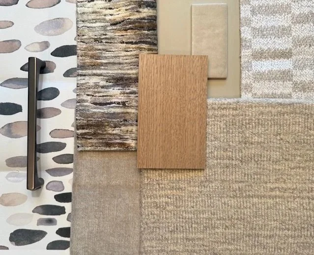
A soft, warm neutral that brings light and optimism without feeling fleeting
A color-drenched room in deep umber and charcoal, offering a sense of serenity and enclosure
A muted, nature-inspired palette that connects interiors to the outside world
These choices are less about following trends and more about creating environments that support the way you want to live, now and well into the future.
A Personal, Experienced Approach to Color
Design trends can offer inspiration, but the most compelling interiors are rooted in experience, expertise, and a clear understanding of the client’s vision. Color should honor the architecture of a home, align with the way it’s used, and reflect the emotional tone its owners want to live with every day.
When approached thoughtfully, color becomes one of the most powerful tools in design, shaping not just how a space looks but also how it feels to inhabit it.
Moving Forward with Intention
The colors of 2026 invite us to think beyond surface-level trends and toward homes that feel thoughtful, grounded, and deeply personal. When chosen with intention, color supports a lifestyle and the emotion of home: rooted in comfort, beauty, joy, calm, and quiet confidence.
If you’re considering how color can elevate your home, whether through a subtle refinement or a full transformation, we’d love to guide that conversation. Together, we can create a palette that honors your home’s architecture, reflects your personal style, and supports the way you want to live in the year ahead.
Connect with us here.