Beyond the Trend: Color, Warmth, and What You Actually Love
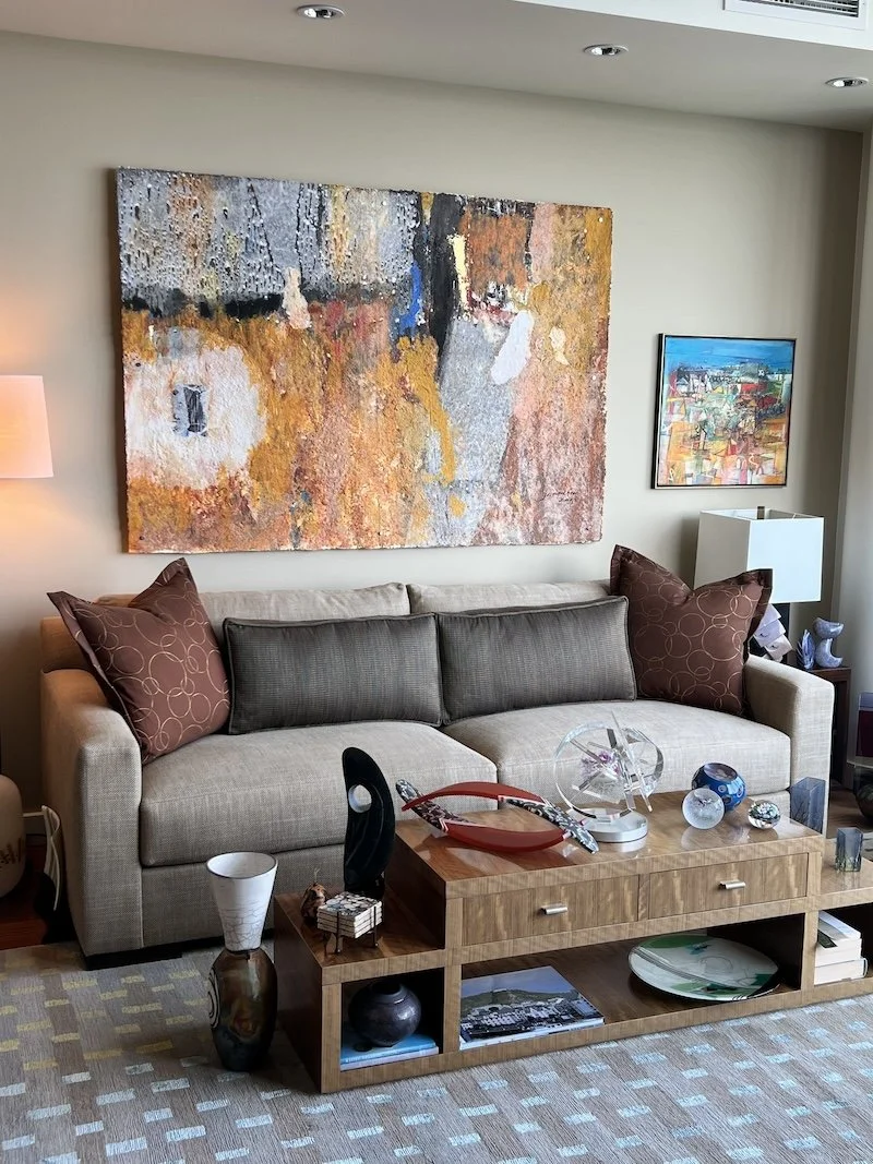
As an interior designer working in the Pacific Northwest, I pay close attention to two kinds of shift at this time of year — the one happening outside, and the one happening in design. September moves by quickly here. The afternoons are still warm. The evenings arrive a little earlier. The light changes its angle — which affects how your home receives it, how it lands on your walls, ceilings, colors. This is the season when we come inside more, when we notice what a home is doing and what it is not.
This autumn there is something else worth paying attention to alongside the season — because the design world is shifting in a direction worth understanding before you make any decisions about your home. And there is a more important question beneath the trend conversation that I want to make sure we do not skip past.
Where Design Is Moving — and What Three Shows Are Saying
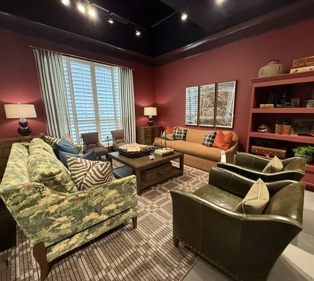
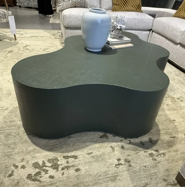
At Salone del Mobile in Milan this past April, the signature shade of the show was orange — from electric tangerine to dusty, muted versions that read warm and intentional rather than just bold for the sake of being so. The dominant shift across the show was toward warmer, more expressive shades: ochre, terracotta, apricot, mocha, and warm chocolate brown. Dark greens and terracotta appeared as the defining color pairing. Natural stone showed up with deep orange tones through to saturated greens. The mood was atmospheric, emotionally engaged, and considerably less controlled than the palette that has dominated the last decade.
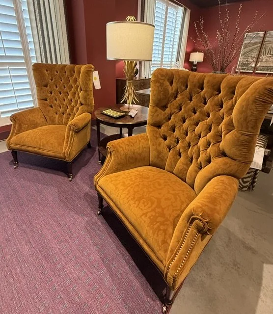
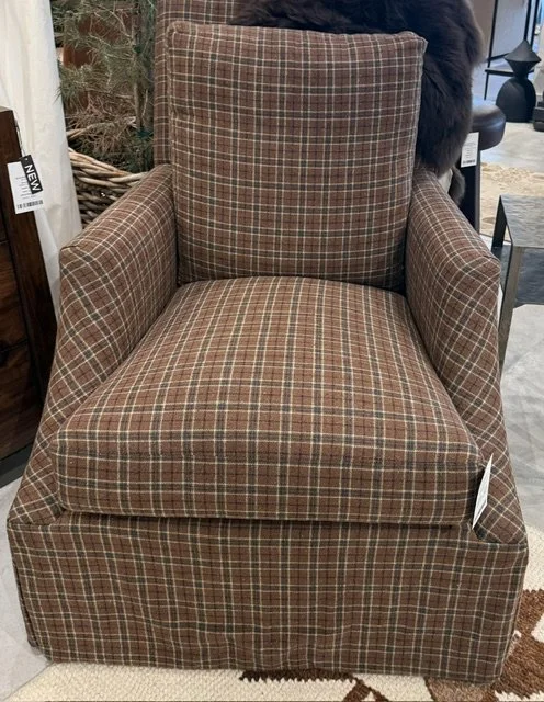
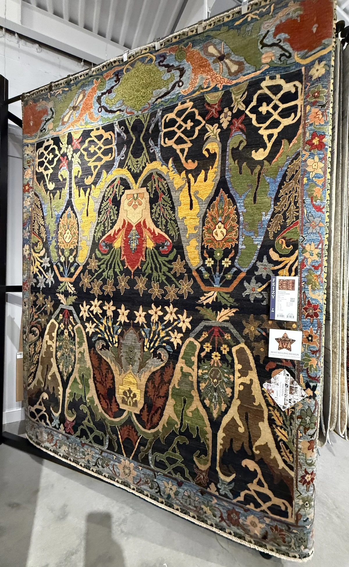
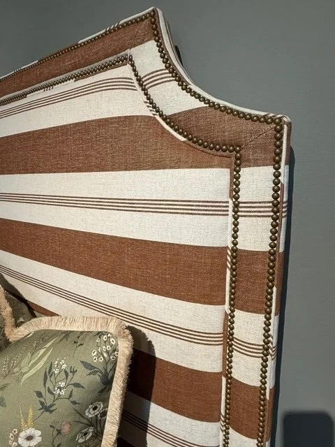
Maison & Objet in Paris in January was equally direct. The conclusion across the fair: cold palettes are receding. Taking their place are warm, earthy tones with maturity and intensity. Chocolate brown, caramel, terracotta, and clay as base colors that embrace a space and create a sense of peace and home. Ochre, amber, and butter yellow as mid-tones. Burgundy and claret for drama. Deep, saturated greens appearing alongside all of it. The Opera Aesthetic — velvet, burgundy, lacquers, and rich lighting — appeared as a named trend for rooms that earn a statement moment.
The September edition of Maison & Objet, newly renamed Pulse and focused on emerging directions, pushed further: bold color is back and unapologetic. Deep jewel tones. Unexpected combinations. Interiors that communicate personality rather than neutrality — bringing out individuality and uniqueness.
Three of the most significant shows in the international design calendar are pointing in the same direction. The era of grey-on-grey and white-on-white is not over — but its dominance is shifting.
Bold or Subtle — Saturation Is the Real Conversation
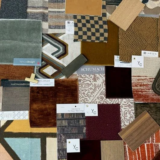
What is worth noting about this palette is that it does not demand an all-or-nothing commitment. The depth of a color — its saturation — matters as much as the color family itself, and it opens a range of interpretations that make this shift accessible for almost any home and personal style.
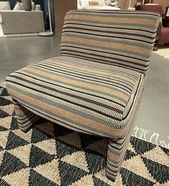
Brown, for example, is not a single conversation. A deep espresso or near-black chocolate reads with drama and authority — it anchors a room in richness. A warm caramel or honey tone does something entirely different: it invites, it warms, it feels lived in. A dusty mocha sits quietly between the two, sophisticated without requiring the room to organize itself around it. All three are part of the same directional shift — and all three will live very differently on your walls, in your upholstery, or across your floors.
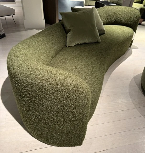
The same is true of green. A deep, saturated forest or hunter green is bold and architectural. A sage or soft olive reads as a natural, grounding tone that happens to carry warmth. A more complex mossy green lands somewhere in between — neither neutral nor statement, but deeply considered. And gold: it can arrive as a lacquered amber that announces itself, or as the quieter warmth of aged brass hardware, honey-toned linen, or a gilded detail that catches light without demanding attention.
The trend is a direction. How far you take it, and at what saturation, is where personal taste takes over — and where the right designer conversation begins.
But Trends Cycle — and They Cycle Fast
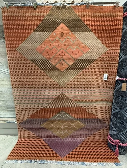
Here is what I want you to hold alongside all of that: trends have always cycled. They cycle faster now than they ever have. The 1990s are cycling back into design conversations as we speak — certain silhouettes, certain textures, a particular kind of layering that felt dated a decade ago and now reads as knowing. A treasured family piece that felt out of step for years can suddenly feel exactly right again. Something behind what is current is always forming.
What this means in practice: the moment a palette becomes a trend — the moment it is everywhere, in every model home, on every showroom floor — is often the moment it begins its decline. What felt aspirational in 2019 can read tired by 2024. And what is filling the showroom floors right now will be in the clearance section in three years.
This is not an argument against warm earthy tones. The palette the shows are confirming is genuinely beautiful and deeply livable. It is an argument for understanding why you are drawn to something before you commit to it.
“Be faithful to your own taste, because nothing you really like is ever out of style.”
— Billy Baldwin, American interior decorator
Grey Has Always Been Part of My Story
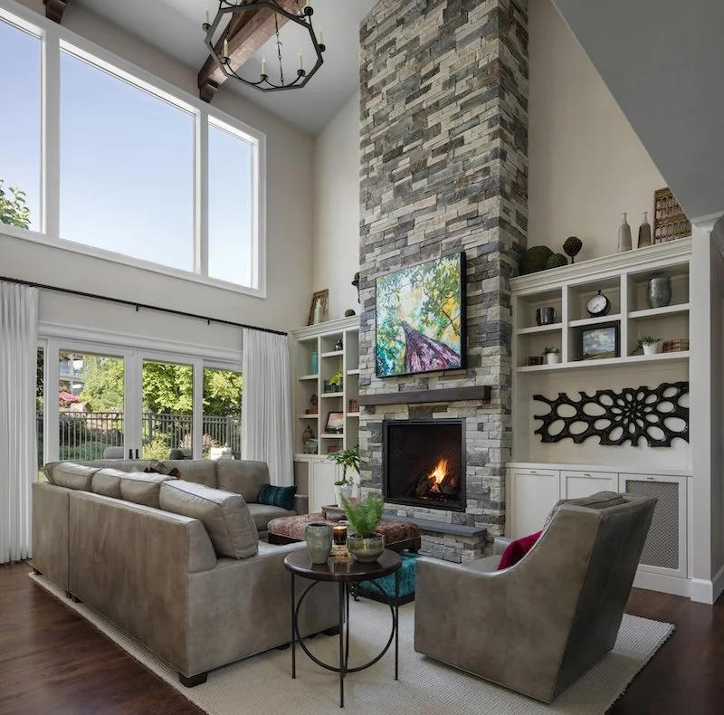
Grey has been woven through my life in design since the beginning — long before it became the defining palette of the last decade. My parents chose a grey called Silver Fox for the carpet in my childhood home. White walls. Bold red chairs. A richly patterned jacquard sofa in purple-red tones that held its own against all of it. Color as conversation, layered into a neutral ground.
I designed my own home more than thirty years ago in grey and white — not because it was trending, but because I genuinely loved it. White walls gave me clarity and calm. I brought color in through art, through objects collected over time, through accessories that could shift with the seasons without requiring the room to change around them. And a powder bath where I gave myself full permission for something with real drama and real interest. That room did not need to function as a calm backdrop, so it did not.
What is interesting to sit with now, as the palette shifts toward warmth: some of my clients in recent years made the opposite journey. They lived through the brown and earthy tones of the early 2000s, moved toward grey and white, loved it — and are only now finding themselves drawn back toward warmth again. The palette cycles. What endures is the instinct beneath it. Embrace what you have always loved, or be ready for a change that is genuinely new to you — not one you are making because the showroom said so.
The Question That Matters More Than Any Trend
There is a question I return to early in every client design discovery when we begin talking about color — before we open a sample book or pull a paint chip. It is not 'what are you seeing right now?' It is: what do you love? What have you always been drawn to? When you walk into a room and feel immediately at home, what is it about that room?
These answers are different for everyone. And they are far more durable than any trend.
Nate Berkus has made this point directly: he sees it every day — people trying to create a home that someone else told them they should want. A magazine. A trend report. A friend with strong opinions. When a home does not genuinely represent the person living in it, it does not feel right — however current it looks.
The warm palette the shows are confirming — chocolate and caramel, terracotta and clay, ochre and amber, a pop of real orange used with conviction, claret and burgundy for the rooms that earn drama, butter yellow where warmth is everything, dark greens alongside all of it — is genuinely beautiful and worth knowing. But the question is whether any of it speaks to something you already feel, or whether it is simply what you are being shown right now.
The difference between a home that feels collected and a home that feels decorated is exactly that: one was built around genuine feeling. The other was built around what was current at the moment of decision. Social media has made this harder to hear. Scroll long enough and any palette begins to feel inevitable. The work is to hear your own instinct through the noise.
How We Help You Find That Answer
Part of what we do in early conversations is help separate what you love from what you have been shown so many times you mistake it for preference. What do you gravitate toward when no one is watching? What made the room you have always loved feel the way it did? What color or material have you come back to in your imagination — not because it was on trend, but because something in it felt like home?
That conversation — not the trend report, not the showroom floor, not what is performing on Pinterest this week — is where the right palette begins. The international shows are a useful lens for understanding what the design world is thinking. They are not a prescription. Your home should feel like you, built around what you genuinely love, and designed to outlast the next several trend cycles without feeling behind.
Also worth reading: Fast Isn't Cheap. Not in Design. — what every interior design project comes down to.
If you're thinking about what a project might look like — and when to bring a designer in — our post on when to hire an interior designer is a good place to start.
Jennifer Myers is the founder and principal designer of J. Myers + Associates, based in Lake Oswego, Oregon. If you're beginning to think about a new home, a renovation, or a furnishings refresh before the holidays, we'd love to start the conversation.