Burst of Joy: A Designer’s Take on Dopamine Decor
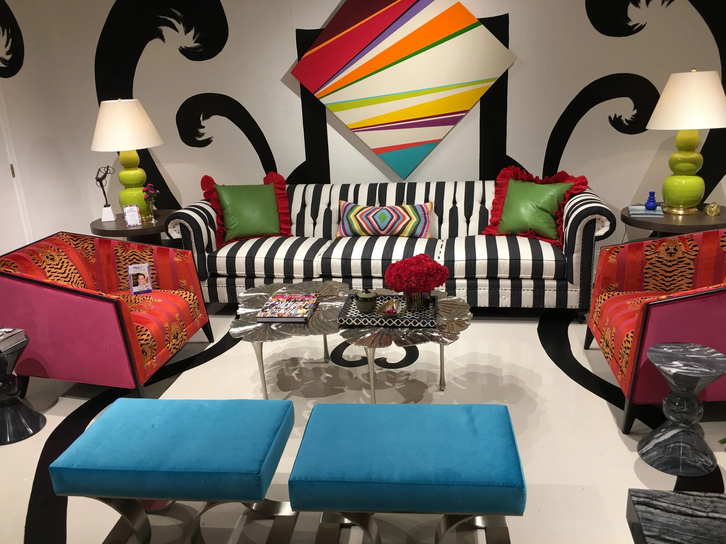
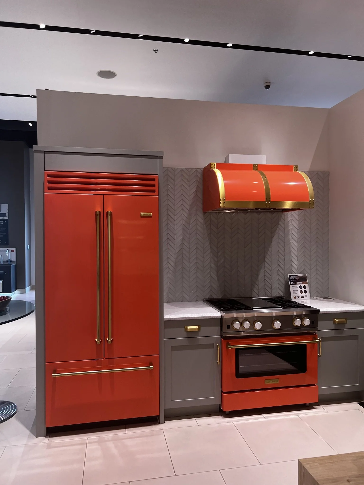
Bold color and playful design – often tagged as “dopamine decor” – are lighting up the design world right now. These spaces, sometimes called “color bombs,” are filled with saturated hues, unexpected pairings, and joyful patterns. They’re undeniably eye-catching, but they can also veer into chaos without a guiding hand. As a designer, I see dopamine decor a little differently: not as an all-or-nothing style, but as an intentional use of color to elevate mood, reflect personality, and create spaces that feel both restorative and full of life.
What is Dopamine Decor?
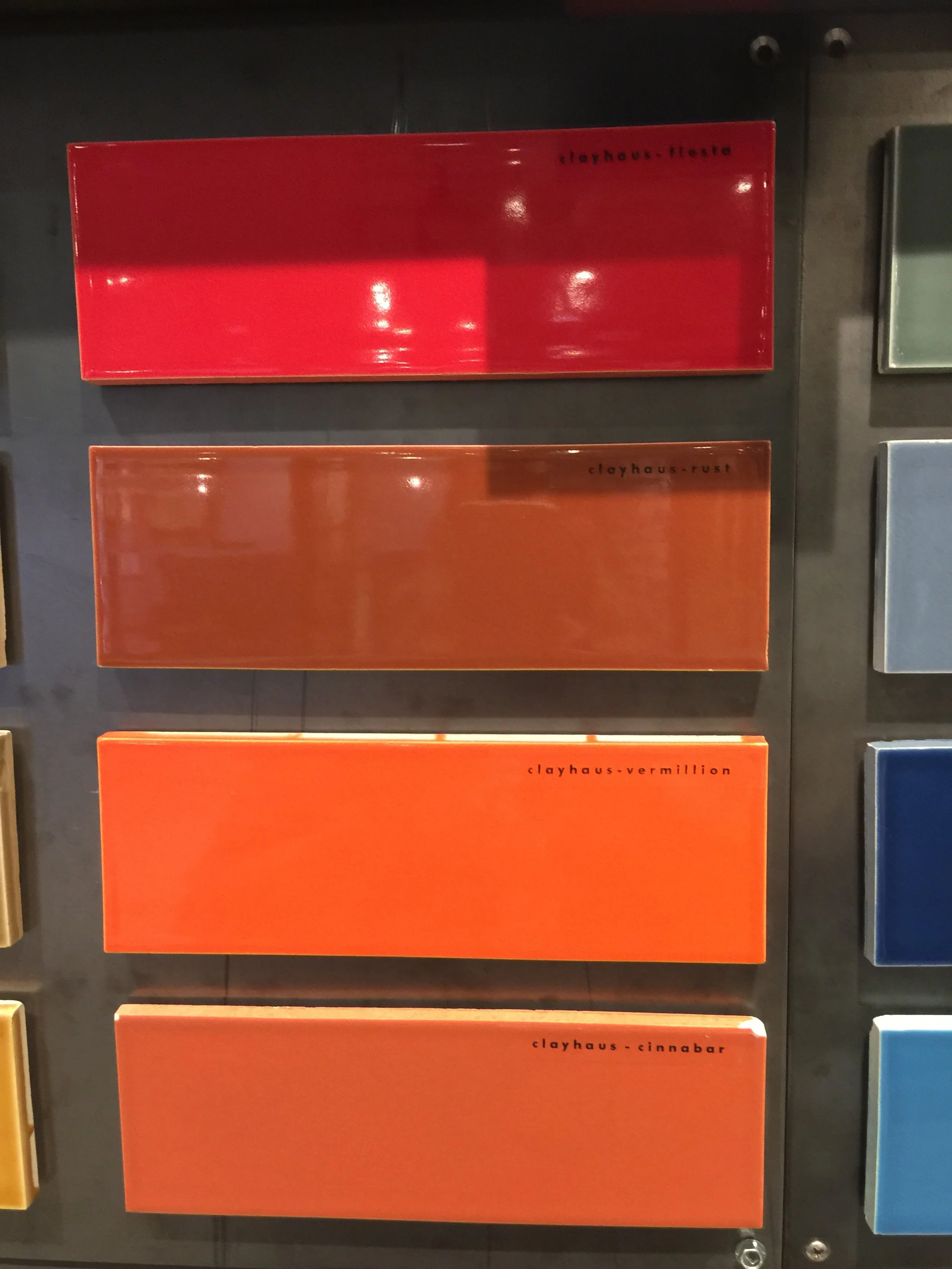
At its core, dopamine decor is all about joy. The name comes from dopamine, the neurotransmitter that regulates pleasure and motivation. When we surround ourselves with hues proven to spark emotion like vibrant reds, sunny yellows, lively greens, and euphoric purples, we’re creating a setting that can boost energy, creativity, and happiness.
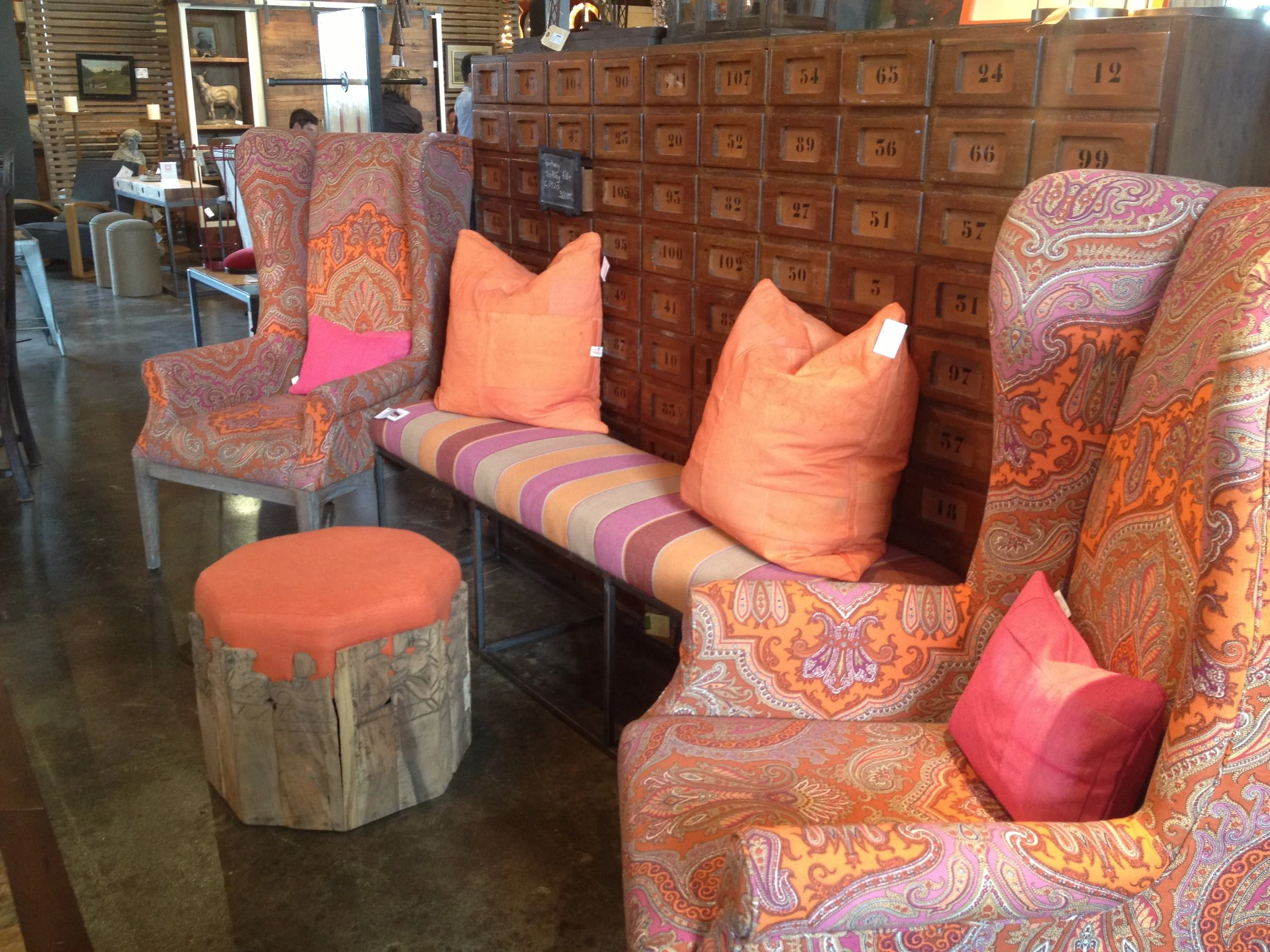
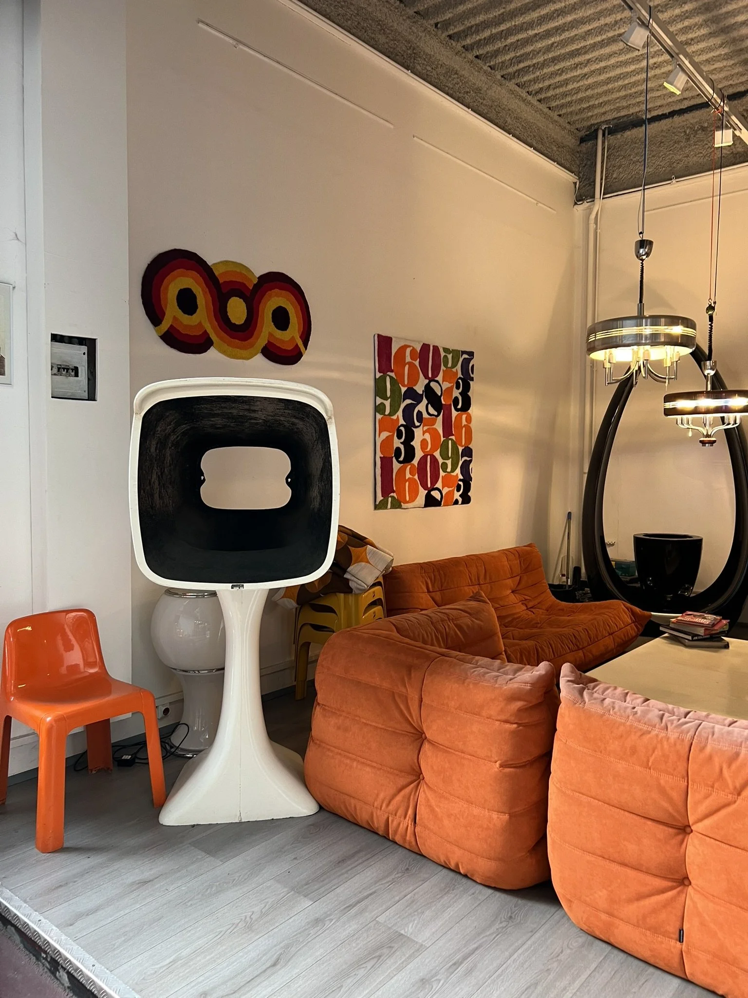
It’s a design approach that embraces boldness and playfulness, often leaning toward maximalism. Think saturated walls, statement patterns, sculptural furniture, and textures that make you want to reach out and touch them. While pared-back neutrals will always have their place, dopamine interiors invite us to live with unapologetic color—and the emotional lift that comes with it.
My Perspective: Color with Intention
While I rarely encounter clients who want their entire home swathed in saturated tones, color still plays a vital role in nearly every project. To me, the key is intention. Rather than overwhelming the senses, I like to create moments of joy through thoughtful bursts of color.
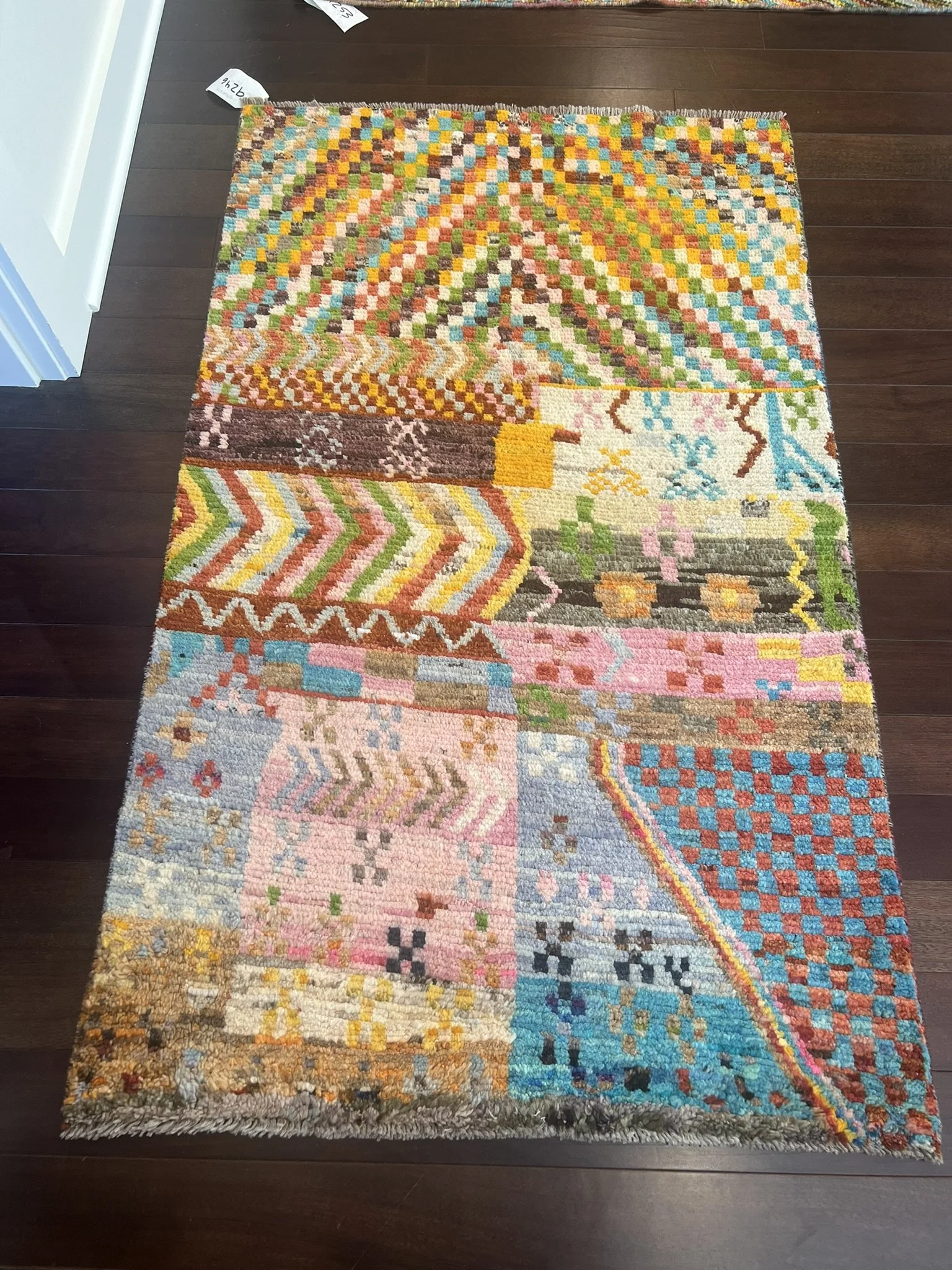
That might look like a jewel-toned wallpaper in a powder bath, cabinetry painted in a daring hue, or a rug that anchors the room with bold pattern. Sometimes it’s artwork or a collection of accessories that introduces personality without overpowering the space.
Most importantly, the palette should reflect the homeowner’s interests and story. I often ask clients: What color makes you smile? What shade do you instinctively gravitate toward? Color is deeply personal. Our bodies and emotions respond to it. Embracing those natural preferences, with confidence and purpose, creates interiors that can resonate with those that inhabit them.
Inspiration Around the World
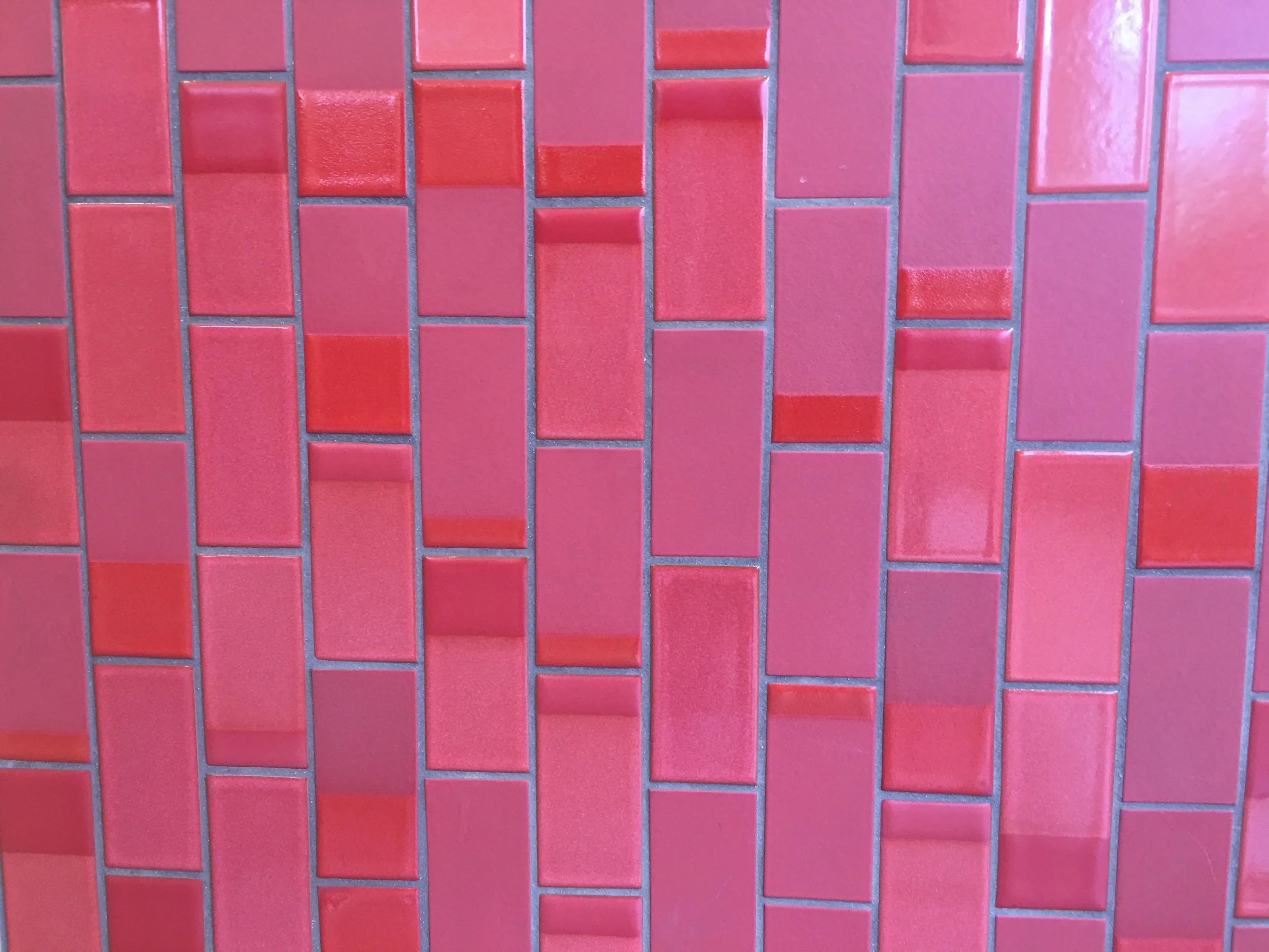
Travel continually shapes my eye for color. Globally, cultures have long embraced joyful color as part of everyday life. I think of the painted facades of Bo-Kaap in Cape Town, where each house beams with its own vibrant identity. In Lisbon, patterned tile transforms walls and floors into joyful mosaics. In India, market stalls overflow with block-printed fabrics in hues that feel as alive as the streets themselves.
These inspirations remind me that color-forward design isn’t about chasing a trend; it’s about celebrating life. The goal is never to mimic a scene wholesale but to translate that same spirit of joy into interiors that feel livable and deeply personal.
Final Takeaway
Color-forward doesn’t have to mean color everywhere. When used thoughtfully, vibrant hues can energize, soothe, and tell your story in ways neutrals never could. The best interiors balance joy with intention, creating a home that not only looks beautiful but feels good to live in.
Ready to explore your own dopamine-inspired palette? A designer can help you find the colors that bring you joy – and bring them to life in a way that’s as considered as it is colorful. Touch base with us today.
