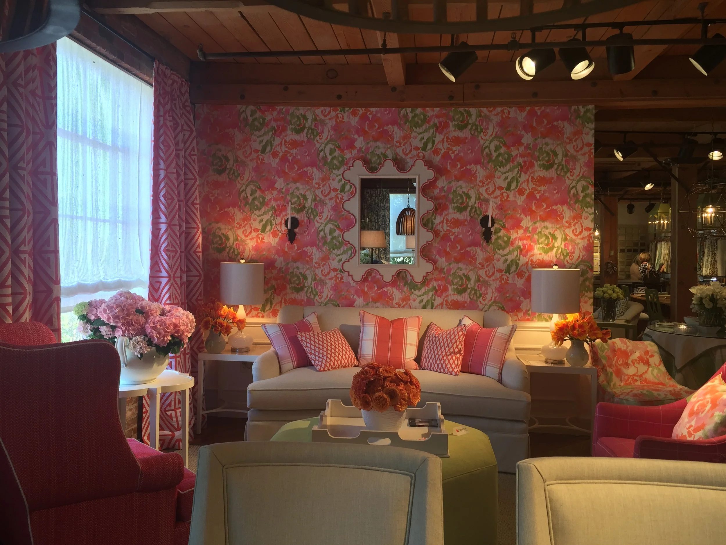
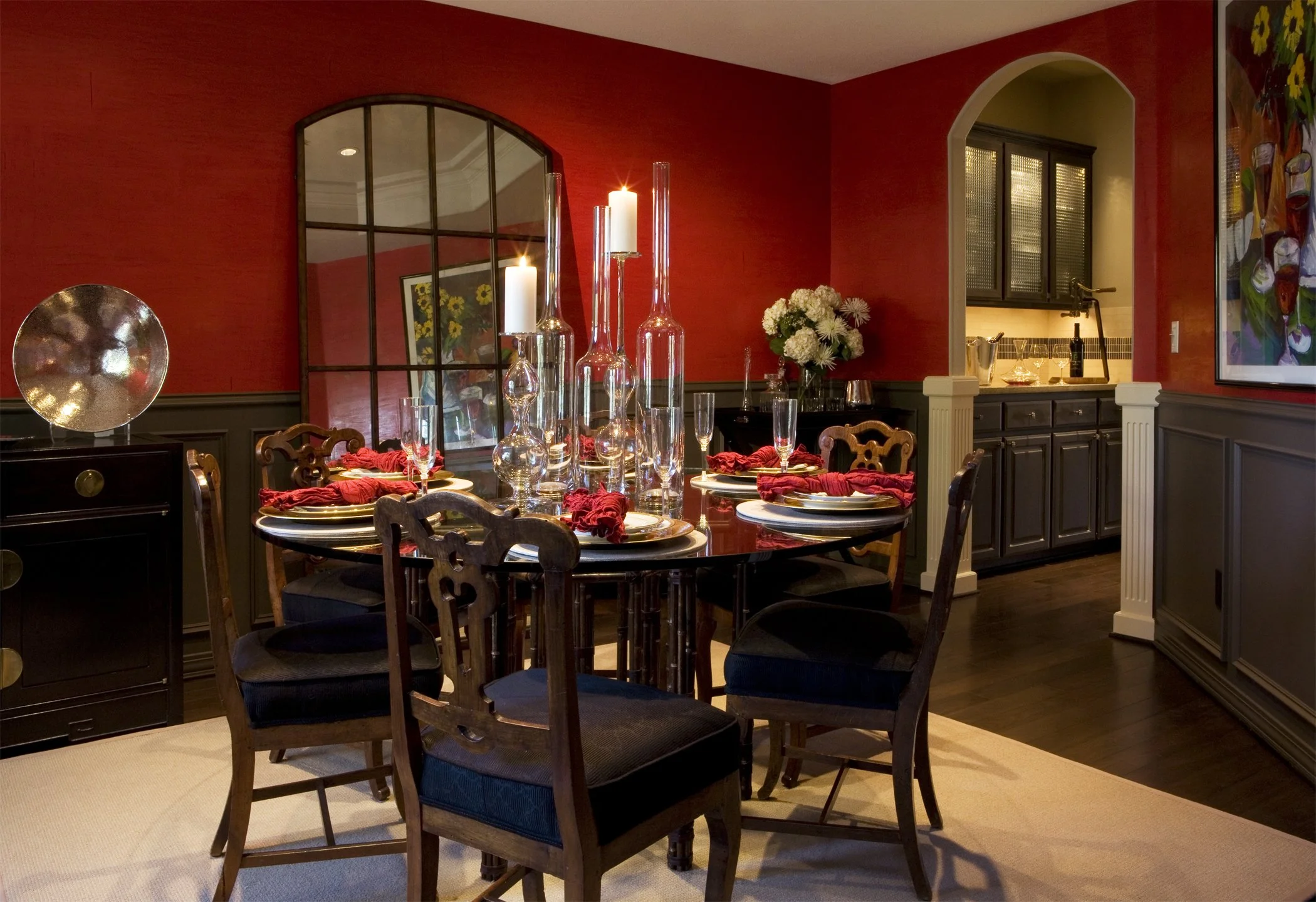
Reasons to Embrace Color Again: Rediscovering Individuality in Interior Design
For more than a decade, interiors leaned toward the “safe” side. After the recession, we saw a wave of neutral spaces: gray walls, white kitchens, beige carpets, predictable finishes. These choices made sense at the time: homes needed to feel marketable and timeless, especially when resale was top of mind. Developers, stagers, and even homeowners all embraced the look.
The result? Spaces that photographed beautifully but often felt more like staged sets than sanctuaries. In the process, something important got lost. The individuality and soul that make a house feel like home became an afterthought.
Today, the tide is turning. People are craving authenticity again. They want rooms that reflect their lives, their stories, their joy and not just a formula copied from the house next door. And one of the most powerful ways to bring that personality back is through color.
How We Got Here: The Cookie-Cutter Era
Design has always reflected cultural and economic moods. After the 2008 recession, homeowners leaned toward caution. Playing it safe felt necessary, and it showed up in interiors.
White shaker cabinets, subway tile, quartz countertops, and “greige” walls became the default recipe. This palette was marketable, easy to replicate, and unlikely to scare off potential buyers. For those building to sell, it made sense.
But for those building a home to live in, the tradeoff was individuality. Homes started to blur together. Whether you were in St. Louis or Sacramento, it seemed every new build or remodel looked nearly identical. The formula was light oak floors, black accents, and a sea of neutrals. Safe, polished, and resale-friendly, yes. But also a little soulless.
This isn’t to say those choices were wrong. In the moment, they provided order and calm when life felt uncertain. But as with every design cycle, the pendulum eventually swings back.
Why Color Still Matters
Color isn’t just a finishing detail. It’s the emotional undercurrent of a space. The hues we live with influence how we feel, how we work, and even how we rest.
A celadon bedroom can calm the mind at the end of a long day.
A deep green dining room invites conversation and intimacy.
A spicy ochre kitchen energizes mornings and makes gatherings feel alive.
Color also carries a story. Terracotta may remind you of a childhood home. Indigo might call back a favorite trip abroad. Warm golds could be tied to memories of a grandmother’s living room. These connections are what give color its soul. It’s not just paint on a wall, but a thread to memory and meaning.
When chosen with intention, color transforms a house into a lived-in home. It’s less about “designing for resale” and more about designing for how you want to live and to feel inside your own home.
The Return of Warmth
After years of gray and white dominating interiors, we’re witnessing a collective shift toward richer, more soulful palettes. Saturated earth tones – ochres, clays, mossy greens, and deep browns – are reemerging, often paired with moody charcoals or vibrant jewel tones.
These colors feel grounding. They carry weight and warmth, offering comfort in a world that often feels fast, digital, and disconnected. Unlike their neutral predecessors, they don’t just stage a home. They invite you to live in it.
This isn’t a fleeting trend; it’s a return to authenticity. Homeowners are less concerned with whether a color will appeal to the next buyer and more interested in whether it resonates with them. The new priority? A home that feels soulful and reflects your personality.
Creative Ways to Reintroduce Color
Bringing color back doesn’t have to mean every wall is bold or every pattern overwhelming. The beauty lies in using color strategically and personally.
Color Drenching
Envelop a room in a single hue – walls, trim, and even ceilings. A soft sage throughout creates calm, while a navy-drenched study feels like a retreat.Unexpected Reversals
Flip the script: dark trim with lighter walls, tonal pairings where trim and wall differ only slightly, or bold interior doors in neutral rooms. These inversions add sophistication and surprise.The Fifth Wall
Don’t forget ceilings. A pale blue in a bedroom echoes the color of the sky. A terracotta ceiling in a dining room draws warmth upward and reflects the chandelier lighting exquisitely. This often-overlooked surface can change the entire mood.Dining Spaces with Depth
Rich, enveloping shades like navy, teal, butterscotch create intimacy and spark conversation. These palettes make every meal feel intentional, even ordinary weeknight dinners.Family Rooms & Dens
Cocooning colors like earthy greens, deep blues, or terracotta shades wrap a room in comfort. For those who prefer lighter palettes, softer versions of these tones can still add personality without heaviness.Home Offices
With so much of life now happening at home, workspaces deserve thoughtful color too. Coral or teal can energize creativity. Muted blues and greens encourage focus and calm.Light & Lifestyle
Our relationship with natural light has shifted as we spend more hours at home. Warm tones glow in the afternoon sun, while cool shades balance overly bright spaces. Paying attention to daylight patterns helps color work with, not against, your rhythms.
A Look Back: Color Through History
This “return to color” isn’t new. It’s more of a rediscovery. Historically, color has always been woven into the way we live at home.
Kitchens once brimmed with cheerful hues with mint green cabinets, butter yellow walls, and cherry-red appliances in the 1950s, reflecting post-war optimism and energy.
Studies and Libraries leaned into gravitas with oxblood, forest green, and navy, creating focus and cocooning calm.
Bedrooms across eras rarely defaulted to white. Jewel tones in the Victorian age fostered romance; mid-century pastels reflected optimism.
Looking back reminds us that neutral palettes are the exception, not the rule. Most of history embraced color boldly and personally.
The Soulful Approach to Choosing Color
So how do you choose color in a way that feels authentic? Start with how you want to feel.
Restful bedrooms might call for muted blues or a soft blush..
Inviting dining rooms thrive in rich, saturated tones.
Creative studios can hum with energy in coral or goldenrod.
Layer in story. What colors connect to your personal history? Which hues bring joy or nostalgia? Let those guide you more than trends.
And remember. Neutrals aren’t wrong. They can serve as grounding backdrops when paired with color in thoughtful ways. The point is not to eliminate them but to move beyond a fear of experimenting.
Closing Thoughts
This isn’t about dismissing the choices of the past. Neutrals and minimalism had their moment, and for good reason. They provided calm and simplicity when the world felt uncertain.
But design is evolving. Today’s conversation is about rediscovering individuality and soul. It’s about using color not as a trend, but as a tool for expression.
Color is the invitation. Not a demand for boldness, but a gentle encouragement to explore, to reconnect with what resonates, and to let your personality shine through.
Homes aren’t meant to be staged sets. They’re meant to be lived in and layered with soul and meaning. And nothing brings that soul back faster, or more beautifully, than color.


